Loading...
We did classification tests on our CDC dataset.
There are some more information that wasn't shown directly on data. For example, death rate in CDC Covid-19 dataset. In this part we labeled death rate on CDC dataset and tried all 6 classifiers to classify data by death rate, in order to figure out how well they each did on this classification task.
We evaluate their performances by accuracy_score, classification report(include precision, f1-score, macro avg, weighted avg for each class.)
We also plot ROC curve and aur_score for each classifier. As we know sk-learn only supports ROC curve for binary classifier. It's typical to draw a ROC curve by each class. So we will transform the result data into a binary one for each class, and then draw them on the plot by class. Check them down below.
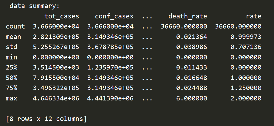
We first dealt with the missing and error in the data based on the analysis of Proj2. After that, we use tot_death and tot_cases in the processed data to divide and calculate the corresponding death_rate. This variable can be understood as the proportion of deaths in all cases.
Next, according to the value of death_rate, we perform labeling for later classification. Mark the top 25% part of death_rate in the data as type '2', which represents high mortality; mark the 25%~75% part of death_rate in the data as type '1', which represents medium mortality; mark death_rate in the data The last 25% of the part is marked as type '0', which represents low mortality.
The figure below shows the Data summary, including the 25% point and 75% of death rate:
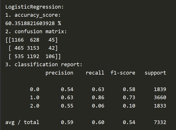
Here is the accuracy rate, confusion matrix and reports generated by Logistical Regression:
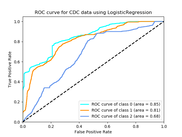
The ROC curve is:
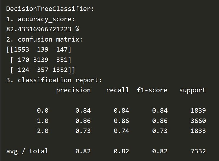
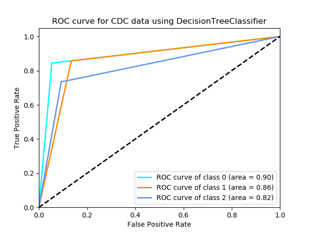
Here is the accuracy rate, confusion matrix and reports generated by Decision Tree:
The ROC curve is:
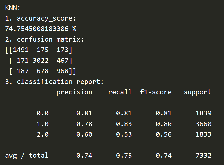
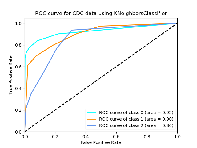
Here is the accuracy rate, confusion matrix and reports generated by kNN:
The ROC curve is:
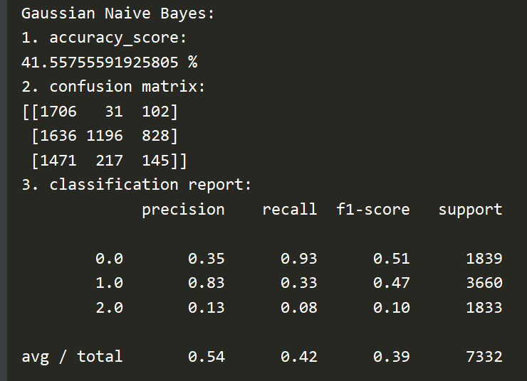
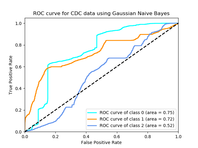
Here is the accuracy rate, confusion matrix and reports generated by Naive Bayes:
The ROC curve is:
For the classification task done by SVM, well the result wasn't satisfied and it took more than the sum of all other 5 methods to finish. We used our training dataset to train this model and use validation dataset to test its performance. I tried all 3 SVM models, which are svc, NuSVC and LinearSVC. SVC did best so the result is performed by svc here.
We also used cross validation to train this model, still not so good.
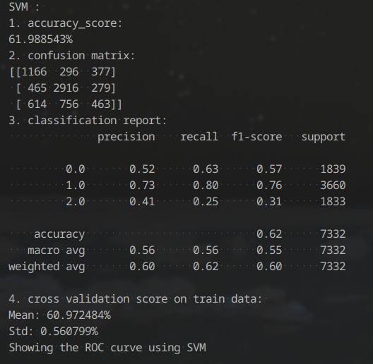
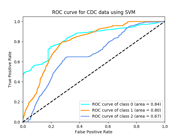
The ROC curve is:
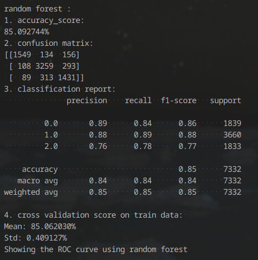
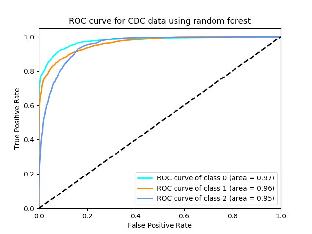
For the classification task done by random forest, it did really good. We used our training dataset to train this model and use validation dataset to test its performance.
The ROC curve for random forest is also quite good-looking. It shows strong relation for each type.
Here is the comparison of all six algorithm:
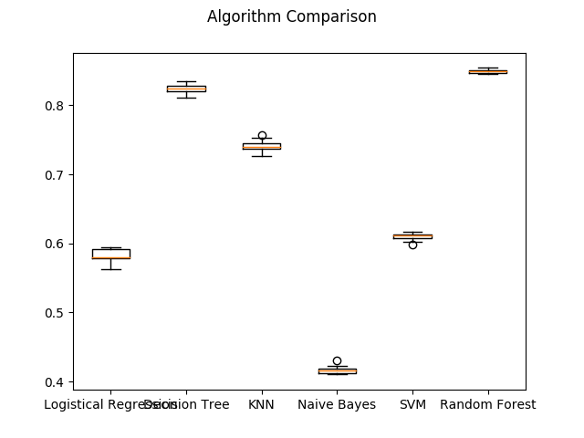
Note that our labels are formed by calculation of a few columns. So from all these 6 classification accuracy result we can learn that:
Random Forest and Decision Tree did best in our classification taskNaive Bayes did worst in our classification taskNaive Bayes might not detect much division relationship, while Random Forest and Decision Tree does.kNN is in the upper middle.SVM and Logistical Regression are not quite good as the best. But they did not too bad. However they cost most of the time.